Wednesday, September 21, 2011

The Body in New York

So Mercedes Benz Fashion Week just wrapped up in New York and among all the trends that popped up, two particularly caught my eye. The 1920's flapper silhouette and a 1930's evening wear silhouette. These two silhouettes have seem to come into fashion every few years. I believe its because of the comfortable and effortless elegance that these styles exude. Here  are two story boards comparing the Sring/Summer 2012 silhouettes to that of their inspirations period.


1920's

As you may or may or may not know the 1920's ushered in a whole new woman history had never seen before. Corsets were done away with and a boyish silhouette was all the rage.

1930's

In the 1930's the woman's silhouette began to return to a wait line fitted closer to the body and wider hems. Ostrich feathers like the ones seen on Ginger Rogers had been popular since the previous decade but continued strong into the 1930's infusing a weightless elegance to evening wear dresses.

Other notable trends seen at New York Fashion Week were a lot of floral patterns in bright colors. Bright colors in itself were a huge trend weather they were prints stripes or color blocked color was used in a huge way. Sportswear (as usual) was seen everywhere but done in unconventional fabrics almost bringing it to an upscale daywear level. Another trend that always seems to be around, and still going strong is the African safari theme. Using all kinds of prints from animal and floral to geometric and in colors ranging from browns & beiges to Chartreuse and Fuschia.

Wednesday, September 14, 2011

LADUREE NYC!

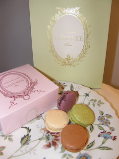
The long anticipated wait is finally over and Laduree has finally opened up shop in the United States. Laduree which is world famous has shops all around the globe from Japan to Switzerland and now New York City! They opened doors August 29th and they've been packed with macaron munching new yorkers and tourists alike. Being that I love macarons (not to be confused with macaroons) I had to try the legendary Laduree macaron for myself so my friend and I headed to their Madison avenue shop. As I walked up Madison avenue I only had to see a line heading down the block to know we had found Laduree. Equipped with a door girl and all we patiently waited till we were allowed inside, only to wait on another line to make our purchase.
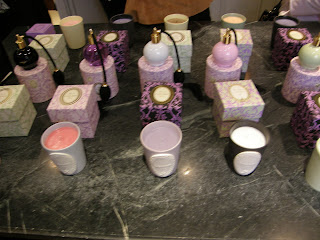
While inside you can really appreciate the Laduree atmosphere the pale colors, the antique art, the smell of sweet macarons and of course the delicious taste.

I was very Inpired by all the colors and textures at Laduree so I created this mood board for inspiration


Turkish Taste at the Court of Marie Antionette : The Frick Collection

I recently had the pleasure of returning to one of my favorite NYC museums, The Frick Collection for a special new exhibit: Turkish Taste at the Court of Marie Antoinette.
The Frick Collection is really a rococo lovers paradise. The Boucher room and The Fragonard room are worth a visit all their own.

The small "cabinet" room which is normally closed is where the Turkish Taste exhibit was held.
The exhibit consisted of two console tables, two oil on wood painted panels and two camel shaped fire-dogs. Here are Pictures
Here are a few detail shots of some of the artwork...

This trip was really inspirational so I decided to research more on the mode of Turkish taste in Europe during the eighteenth century. There had been a huge infusion of Turkish inspired designs for everything from boudoirs to pocket watches. I also found many interesting paintings of Turkish inspired fashions hairstyles and headdresses. Here are my inspirations...
Before leaving the museum I had to stop into the gift shop where I always like to pick something up before leaving. This time I bought a Riesener themed pencil case with twelve colored pencils. The Riesener detail shown on the cover comes from a commode he designed which was purchased by Henry Clay Frick in 1918. One year before he died. Riesener was coincidentally also the official cabinet maker to Marie Antoinette and the French court of Louis XVI.


Thursday, September 8, 2011

MOMA NYC

Last October I went to the Museum of Modern Art here in NYC for my first time. As a native of New York, this is rather shameful to admit. Once inside the lobby you are overcome by its massive spaciousness. Its architecture is large and square like a warehouse yet streamlined like a gallery. In this setting you can really take in large scale artworks like an installation of one of my favorite artists, Kara Walker.

The huge panoramic installation was too large to capture in one shot so I took two and merged them together in Photoshop. It's one of my favorite museum photos I've taken. hope you like...