Monday, December 19, 2011

Creepy Christmas NYC 2011

Looking around at department store windows this holiday season, there seems to be a creepy slightly dark inspiration going around.

Growing up on Long Island I remember every few years during the holiday season my parents would take my sister and myself into Manhattan to experience the city in all it's holiday splendor (this was most common the years family was visiting from Chile.)  The Rockefeller Christmas tree among others were usual stops on our itinerary but my favorite was always the holiday windows. Window displays were always a huge deal to me any time of year but especially during the holidays.

So here are a few pix from this years holiday windows that I would say embodied a slightly creepy vibe. You look and decide for yourselves. 

The Macy's holiday windows below reminded me of Edward Scissor Hands shaving ice sculptures creating snow and the factory scene with all the gears and gizmo's. 


The next picture is of the Bergdorf Goodman holiday windows. Black and White is an unconventional choice for holiday decoration. This window reminded me of that creepy feeling I get when I walk through the dim taxidermy exhibitions at the Museum of Natural History. I love that feeling and love this window although I'm not too sure little kids could appreciate it.


This last window is one of the most interesting, it's Barney's Lady Gaga window. The entire display is or appears to be made of hair! ranging from golden to platinum blond you can find them all here. Again, I love the concept but not too sure it says "Happy Holidays" 


Aside from these windows, of course there were plenty that screamed holiday cheer but it was these that made me wonder about our society and department stores today.


The Body Grotesque: My Final IDS Project

I thought it would be appropriate to post a few pix from my final IDS 2D collection presentation. The collection objective was a narrative, to create a story. I started with the concept of Frankenstein.

My story grew into a tale of a mad designer who digs up and sews together the corpses of Mary Shelly, author of Frankenstein and Rose Bertin, couturier to Marie Antoinette. He brings the creature to life and flee's, returning to the world of high fashion leaving his creation in a run down atelier to fend for herself. Instinctively the creature begins to create. Infusing aspects of Mary Shelley's romanticism and horror with the grandeur and elegance of Rose Bertin she creates a paradox of a collection. When the creature who's been cast away from society because of her monstrous appearance discovers her creator, she terminates him and then herself leaving behind only her creations in the run down atelier. When the story breaks of the murdered haute couture designer an investigation ensues and the narrative comes to light shocking not only the fashion world but the world of science and media as well. The fascination leads to exhibition and makes the history.

Long story, I know, it just grew on it's own. Aside from other concepts, my narrative led me to ideas of the body and silhouette. Because Frankenstein was made up of various stitched up corpses and animal parts, it was fitting to address freakish and grotesque body silhouettes. I wanted to do this but with the added elegance and materials Rose Bertin would bring, here was the outcome...

Friday, December 16, 2011

Thanksgiving NYC


The Macy's Thanksgiving Day Parade in NYC is one of the most televised Thanksgiving events in N.Y. Every year we tune in as my mom preps Thanksgiving dinner. This year I had the pleasure of going for the first time with my niece and my sister. It was great fun and is something every New Yorker should definitely do at least once. Being that I'm the worst picture taker alive I don't have much to share but here is one of my niece standing as a smurf float passes by.

Here's another of my mother's delicious Thanksgiving table (sans le gigantic turkey, I'm not sure where it was at that point) 
and lastly a pic I took of my family huddled around the table...
...Just our traditional Thanksgiving we enjoy every year, I couldn't imagine a Thanksgiving any other way and hope to share many, many more with the people I hold dearest to my heart... I cherish my family & our traditions a lot, although I'd never let them know it lol.
They're my heart.


Friday, December 9, 2011

18th Century New York

Of all the historical era's my favorite by far is the 18th Century. Touted as the age of enlightenment it was also an age of extravagance. Lately I've been watching a lot of movies from my period film collection because I all I have in my workroom to keep entertained is my old Mac from high school. While watching Sleepy Hollow with Johnny Depp and Christina Ricci.

 I was really drawn in by the recreation images of New York City during the 18th century. So being that we have to stick to ideas about the body or New York for our blogs, I thought it would be an interesting way to merge my love of all thing 18th century with my love of my favorite city in the U.S. Here are some images from the movie recreating NYC.
It's a good film thats definitely worth a watch if you haven't seen it.

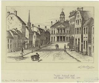
Taking a more factual look at 18th century New York I found these etchings. The first is of Federal Hall at Wall Street from 1789.
Here are two other views. This Federal Hall must have been an important building in NYC during the 18th century because it is one of the most easily found images of 18th century NY.
The next images were the most interesting to me. The first is of a theatre and the second are actual garments 18th Century New Yorkers wore.

I really enjoyed searching for images of 18th century NY. In the future I would love to design an 18th century inspired collection.


Saturday, November 12, 2011

Fusion 2012

So if you go to either Parsons or F.I.T. you may have heard of a design competition called Fusion. For this post I just wanted to share my application with you. I wish I could say that my application was accepted and I was going to compete BUT it wasn't and I won't be, which may have come as a blessing in disguiese because I have no idea how i would have made time for work, school work and still made time to complete the five looks in just five short months. Either way here are the pictures from my application. I'd love to hear any feedback on my designs or any other related comments.


My Skin Tone Illustration Method

I have to say that in all of my years of doing fashion illustrations in marker, I've managed to develop somewhat of a method. I thought I could share my skin tone method with you all in hopes that I can either help others with my techniques or get tips on marker techniques I may not be aware of that could improve my Illustrations.

First I always start with a pencil drawing of my illustration. The beauty of marker paper is that it doesn't bleed through ( if you get the good quality paper) and it's translucent so you can layout your illustration in pencil and place it under the marker paper as a guide without having the graphite lines on your finished product.


My favorite marker paper is the Canson Marker Pro Layout paper and I work on 14x17" size because it allows me to get in finer details on my illustrations versus when I work on 11x14" size paper.

So the very first thing I do is "wet" my paper with the colorless blender in the areas I'll be markering first. For me this is always the skin tone. Laying down the colorless blender first will allow for greater color blending once you go in with color. I start with my lightest skin tone leaving blank any highlights on the skin. Then blend the skin tone color into the blank highlight area. After this i let it dry then go in again with the same skin tone color which deepens the color a little further, Then blend.


Now I find a darker skin tone color to begin to shadow. Just as before I use the colorless blender first then apply my first layer of the darker skin tone for shadow, then blend again. At this point you give it a minute to dry as before and go in again with the same darker skin tone maker to further establish shadow. After this if you guessed Blend, you're correct! we blend once again to diminish any hard lines in color differences.

Now Most people would finish there but I've learned by studying other illustrators work, that if you add some more shadows with a light grey marker it really establishes a more realistic effect. For instance if you ever looked closely at photographs or if you've ever drawn from life, the shadows are cast in grey tones. This is the most difficult part because if you put the grey shadow in the wrong place it can ruin a great drawing but if done properly It will really give that photo realistic effect to your illustration. This is why I always start with a 10% grey marker and increase as neccesary. If ever you have a doubt of where shadow should go you can find a photo of a model in a similar pose to that of your illustration and lay down the shadows accordingly. Once this is complete Voila! you have a gorgeous skin tone on your figure that will enhance the clothing and overall composition of your illustration.


If I had one very important tip to give is never underestimate the power of the colorless blender! It really makes the difference between having a flat cartoony image to something that has more dimension and weather this is your illustration style or not it's always great to practice different techniques because the more tricks you have in your arsenal will allow for greater ways of expression.

Halloween 2011 Long Island/NYC

This year I had the pleasure of making my Halloween an eventful one. My two cousins from Chile were visiting just in time for me to show them what Halloween was all about in New York. In Chile Halloween is celebrated but not nearly on the scale it is here. As you may or may not know Halloween has been adopted by many modern cultures and societies around the world but it's more of a chance for kids to dress up and trick or treat, and while that is still the heart of the holiday her in the U.S. it's also become an excuse for teens and young adults to unleash their inner child and wreak havoc on our city :)

My Halloween started out on Long Island at Bayville Scream Park "Long Islands #1 Halloween Theme Park"


The park boasts about 5 different haunted houses with different themes but the main attraction is the Bloodworth Haunted Manor. They also have a Halloween themed bar inside for the 21 and over crowd.


On Monday October 31st we trooped it to the city to see the Halloween Parade in the village. It was packed as usual but got to see most of it hanging from a light post lol.

Once the parade was over we headed to Splash Bar where we finished off our night before returning back to Long Island for some R&R. I'd post pictures of Splash but it probbably wouldn't be appropriate HA!